Thursday, 28 November 2013

Digipak and Draft Magazine Advert


This is the completed album cover. We added the 'Parental Advisory' to the original as this looked more realistic and is not a CD for young children to listen to. 


This is our magazine advert so far, we would like to change the artist's image in this by adding an effect such as transparency. This would reflect the sophistication in our music video therefore enhancing the overall effect of the advert. We will also change the quotes by giving a specific person - Zane Lowe, Radio 1. We will reference iTunes to remind people that it can be purchased digitally and we will make the album preview larger. We will also use a hashtag to reference Twitter, as this is a popular networking site used by our target audience. Instead of 'Due to be released' we will change it to 'Out'. Instead of the date we will put 'Coming Soon'. 'Best Seller'. 


This is the completed digipak. 


Album cover photo options


This is our top choice for our album cover, we will edit the photo to make the wine look darker - this will make it look more realistic as it is actually water mixed with red food colouring. 
We want our album cover to look original and simplistic, the wine smashed connotes the star's lifestyle involving alcohol and vandalism as he is a rapper/R&B singer. This photograph was taken on a mirror which gives it the wine it's 3D effect. This also works well with the reflection of the glass shown on the white background. 


This is the photo which is first choice to be on the back of our album, we will crop the photo so the wine glass is to the right of the frame and there will be a white space next to it where we will position the track list. This will match well with the album cover as it uses the same colour scheme.


Analysis of magazine advert


Analysis of Jessie J's magazine advert for her Debut Album Release

This magazine advert is very simplistic and draws a lot of attention to Jessie J and her star persona. She is wearing a black top with black nails, lips and hair which creates a lot of contrast against the plain white background. This works well in highlighting Jessie J and making her the main focus of the poster. The use of gold in the text adds a sense of fame and fortune to the poster which could come under her star persona. The text is also all very symmetrical with her which gives the idea that she is in control.  

Music Video Final Cut

Tuesday, 26 November 2013

Album name

Album name: Immortal

11.     Intro
22.     Aretha (feat. Jay Z)
33.     You Made Me Love You
44.     I Know How You Like It
55.     That Girl (feat. Akon & Usher)
66.     On My Mind (feat. Frank Ocean)
77.     Time’s Up
88.     Caving In
99.     Addicted To Your Love
110.  Immortal (feat. Kanye West)


We wanted this album to tell a story 

These are our song choices for the album, the first song is 'Intro' - In the past ten year, more and more artists have decided to name the first track 'Intro' to introduce the album to listener. We felt we should follow suit.

Aretha 

Friday, 22 November 2013

Design Ideas for album and digipak


This is a moodboard showing the ideas we have for our digipak and album cover. We want to take photographs of wine being dropped from a goblet against a white background. The goblet represents the artist's wealth, it is a conventional prop used with rappers in videos or covers, an example of this is in Drake's album cover for 'Take Care'. He is holding a goblet to make him look wealthy and dominant. 
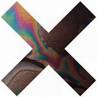
Another idea we had for the album cover was to use a W instead of an X, used in the moodboard and have the goblet with wine in the background of the letter. We don't want the artist in the album cover as we feel it makes it look more professional and original without. 
The font will match the colour of the wine and be small stating the name of the album. 

Thursday, 21 November 2013

Album Cover design concept

I tend to prefer a more abstract looking album cover and this one by the Yeah Yeah Yeahs stood out immediately. Rather than just a generic picture of the artists(s) with the name of the album, this cover grabs your attention with its bold picture. Although the egg would not necessarily fit in with the genre, something like a wine glass smashing with wine in it would fit in the the RnB lifestyle whilst maintaining a very interesting and abstract style.


Also to represent the wealth of our star, we were thinking of perhaps using a goblet full of red wine instead of a glass. An example of this was the Drake- Take Care album cover where he has several expensive looking ornaments to highlight his wealthy lifestyle. 


To show people that it is an album by Waseem, we were thinking of having a W and the image inside the W. We took this idea from The XX album cover.


Friday, 15 November 2013

Rough Cut Feedback

Feedback for our music video:
http://www.youtube.com/watch?v=3Pn0R0qD77s 

1) Strengths: "I particularly like the pink lighting at the beginning of the music video, these look realistic like a real club and the slow motion of the dancing looks good."  


 Weakness: "I think it is slightly repetitive, after a while I lost interest."

2) Strength: "When the singer is on his own with his sunglasses on in front of the blank screen looks professional."

Weakness: "The part where the singer is in the middle and there are two groups each side of him doesn't look the best because not everyone is dancing a lot."


If I was to film this again I would either use different background dancers or make sure they look more engaged as from most feedback we were told they didn't look realistic. 


Tuesday, 12 November 2013

Friday, 8 November 2013

Target audience questionnaire

1. What genre of music do you most listen to?

2. How old are you?

3. Who is your favourite artist? Why?

4. What are the main elements you would like to see in a music video?
( ) special effects
( ) storyline
( ) humour
( ) seriousness
( ) hidden message
( ) star persona
( ) good use of relevant lyrics
( ) Mise en Scene
( ) Flow

5. Where do you get your music from?
( ) itunes
( ) BBC radio
( ) stream online
( ) download from another source online


5 people were questioned in total


Question number               Candiate number               Answer

1                                        1                                        Rap/Hip-Hop
                                          2                                        Pop/Trance/House/Pop/Dance/Trap
                                          3                                        Drum and Bass/Rap/Grime
                                          4                                        Pop
                                          5                                        Classical

2                                        1                                        17
                                          2                                        18
                                          3                                        17
                                          4                                        21
                                          5                                        39


3                                        1                                      

Eminem and Tyler the Creator. This is because of the style of music he produces and his own unique way. In addition there is a a journey in which the artist has travelled to get to where he is know. 
                                          2                                       
Various artists such as Tiesto, Martin Garrix and other DJs. They make music which suits my taste in the genre.
                                          3                                       
Various artists ranging from DJ Hazard, Eminem and Giggs. The artist which I most prefer create some of the best music in the genre also their persona.
                                          4                                      
Various artists. This is a mixture of artists that are in the charts and are well known.
                                          5                                      
Classical composers. These composers differ from the style of music they produce and can create different vibes and moods by changing the tempo of the music.

4                                        1                                      
Storyline/Good use of lyrics/Mise en scene/hidden message/flow
                                          2                                      Seriousness/star persona
                                          3                                      Star persona/good use of lyrics
                                          4                                      All of the above
                                          5                                      Flow


5                                        1                                      itunes/download from internet
                                          2                                      itunes/spotify
                                          3                                      itunes/spotify/music cloud/MP3 Skull
                                          4                                      BBC radio 1
                                          5                                      itunes        


Evaluation:

Candidate 1:  This candidate listens to music that have meaning and has many meanings which are personal to the artists. This is someone that takes music seriously and enjoys long sessions of listening to music

Evaluation of another groups music video


Pros about this music video 

- Good variety of shots of the singer.
- Well used slow motion shots, creates atmosphere.
- The beginning works well in establishing the singer and the location.
- Use of costume reflects the persona of the artist.

Cons about this music video

- Lip singing wasn't quite in time with track.
- Wasn't much emotion shown in body language.
- Unfinished.
- Shots are too long 

Evaluation

Overall this is a good start, however there are many areas where improvement is needed, such as more cuts in the shots, better lip syncing and more emotion throughout the footage would make this a very successful video. 

Thursday, 7 November 2013

Analysis of Target Audience Feedback and changes to be made to Rough Cut

Analysis of Target Audience Feedback

From looking at the feedback from the questions it is clear that there are some aspects of the video that are going to need improvements. It is clear that more footage is going to be needed to add variety to the video and make it less repetitive and more engaging for the viewer. It was also mentioned that a bit of a storyline may help to improve the video and add more of a flow to the video. Another point was that the ending was quiet boring as the beat of the song became very repetitive and there was nothing in this part of the video to keep the viewer interesting. From this feedback we have decided add more footage to the whole of the film, but particularly add some footage at the end of the video which would act as a conclusion to the story in the video. This story would include Waseem and Tamara being together which could include how they met. 

Changes to be made to Rough Cut

We are going to be filming in the drama studio next tuesday. We will film a storyline which will be about Waseem and Tamara meeting and then how Waseem felt afterwards. These shots will include him texting her, which will be direct shots of his phone with the words from the lyrics of the song, and shots of him thinking about her. 


These shots will fit in were the video is getting too repetitive. Then at the end our conclusion will be Waseem and Tamara meeting again and Waseem will mouth the lyrics 'you made me love you' and then there will be a series of speeding up reversed shots which leed back to when he first met her. This will make a good conclusion as it will link the whole song together.

Tuesday, 5 November 2013

Single cover analysis

Our single cover


This is the front cover of our album, we've named it 'You Made Me Love You' after the featured song on the album (the music video).
The different colours used in the single cover represent emotions; red symbolises lust, this links in with the lyrics of the song and the visuals of Waseem and Tamara dancing together. Black connotes mystery which is apparent throughout the music video by use of steam to make the shot less clear. The same colour scheme is used for the front and back to keep it looking iconic and attention-grabbing. 


The back cover features the song 'You Made Me Love You' as it is a single released. The star's name is written underneath in a smaller font, this attracts attention but is still identifiable as the star's name and not part of the song/album title. 
Conventions are used such as the singer being present on the cover and a barcode present. This makes it look authentic and realistic. The record label icons are also present, this gives a sense of realism and shows the artist is developed and not new. The website is on the back for extra information on the star and the small print at the bottom is also present. The star is looking down with the light shining up on him, this makes him look superior.


This is the cover for our single with the spine in the middle, this makes the CD identifiable from the side and matches with the colour scheme. 

This CD cover 'Powderfinger' uses the same colour scheme as ours, using black, grey and blue. This look is also effective in portraying mystery, the blue tear drops being especially effective. This was made for a professional singer, we had no idea of this colourscheme until after ours was designed but I feel it is a good comparison and shows ours looks professional too.


Rough Cut


Evaluation of our Rough Cut 

The video uses a number of conventions to portray the stereotype of an RnB music video, such as the star to represent an attractive star searching for a women in the club. Also the female represents the love interest, this is done by the costume that she is wearing to reveal her feminine features. Also the location of the club  is to create a good slow vibe to the atmosphere which flows with the tempo and beat of the track. The costume of the star is formal to show superiority which is also showed in Justin Timberlake's video, Suit and Tie. 


Another convention which we added was the use of the black and white filter that is used used in many RnB videos to reflect the moment in the scene. In addition the props such as the glasses and the large watch shows that the star is reasonably wealthy which women find attractive and showing off jewellery is one of the most used conventions in modern music videos.


Sunday, 3 November 2013

Libby's Role

My role in the group has mainly been directing, filming and editing. I also organised the setting for the video and supplied the smoke machine which featured in the club setting scenes. During the filming I filmed the majority of the shots while I directed. I focused a lot on the composition of the people in the video making sure everyone was evenly spaced and that the star was always the main focus and was framed in the centre of every shot he featured in. I also tried to get a very large variety of shots by using different angles and lighting to add contrast between every scene. Some scenes I shot head on and some I shot from directly above by using a latch in the loft to film from the ceiling. Some shots were lit from the side to create a shadow on the backdrop, while some I positioned the lighting from behind to create silhouettes. After filming I also edited the shots making sure all master shots were lip synced correctly and the different variety of shots were evenly contributed along the video so that the video would not get repetitive. I added certain filters to the shots to improve the quality of the shots and I also added slow motion to some of the shots as this suited the style and beat of the music.

Target Audience and Feedback

Libby Bond

1. The target audience for our product was people in their mid teens to late 20's or early 30's who listen to RnB. The gender for our target audience was males and females, particularly those who are interested in going to clubs or parties as this was a strong theme in our music video. Fashion was also a strong subject in our video as Waseem was smartly dressed in a suite and the camera often focused on the type of dress Tamara was wearing. Smart and up street fashion is therefore another thing that may contribute to our type of target audience.
2. Questionnaire:
1) Do you find the video engaging and does it keep your interest?
2) Is there a clear star in the video?
3) Can you see a story in the video and is a clear relationship between the characters established?
4) What did you think of the setting and lighting in the video?
5) What would you add to or change about the video?

3. Feedback:
1) - The video is interesting, although it is quite long. Maybe a few different scenes would make the video less repetitive.
- Yes I thought it was very engaging and kept my interest.
- I thought your footage was very good, but the song is so long some different scenes might keep it interesting.
-I think the montage of footage worked well and the video kept my interest.
-I find the ending quiet boring. Maybe if the ending was different from the rest of the video it might regain my interest.
2) - Yes I could tell that the person singing was the star as he was always framed in the centre.
- Yes the star was clearly shown strait from the beginning of the video were the shot opened with him staring up at the camera.
-Yes I thought you presented the star very clearly, and the outfit and glasses brought more attention to him making it very obvious he was the star of the video.
- There was a very clear star in this video and the editing and camerawork made this very clear.
- The star of the video was very clear because of his outfit. He was dressed very smartly which made him stand out in the crowd.
3) - There was a clear relationship between the singer and the girl which was made clear through the editing, cutting between shots of him to shots of her. 
- There was an obvious connection between the boy and the girl in the video, the lyrics of the song demonstrated that he loved her and the video showed this as well.
- Although there wasn't a story to follow throughout the video, there was clearly a background story of the boy falling in love with the girl. The video demonstrated this well and was a clear presentation of him loving her.
- The relationship between the girl and the main singer is established right from the beginning. And the way the camera films her is a good representation of the way the singer sees her. 
- The video shows that the singer has fallen in love with girl, from the scene at the beginning of the video I assume they met dancing in a club. 
4) - I thought the setting and lighting was very good. A lot of preparation obviously went into the presentation and I think it really paid of and made the video look professional. 
- The lighting really made the difference. It looked as though it had been filmed in a club or at a party. 
- The lighting helped to differentiate between scenes with a white spotlight for some scenes and coloured lighting and a smoke machine for other scenes. 
- The setting and lighting for this video was great and really suited the lyrics of the song.
- Everything worked really well and the lighting in particular really suited the feel of the music. 
5) - I would add a few more different scenes in different settings to make the video a little less repetitive. Even more close ups might work to keep the video engaging and interesting.
- There isn't anything I would add or change, I think the whole video works very successfully. 
- If anything I would add in more footage just to make the video flow better.
- The video works really well with the song so I don't think I'd change anything. A bit more footage might work well to make it more interesting.
- I would add a slightly different ending to the video. Maybe have the characters together at the end to add closure to the story in the video. This will keep the viewers interested right up until the end of the video.